A Little Christmas Nostalgia
OOPS!
And then there was the year the printer mixed up the inside names. The first card read “All Is Bright.” The second read “All Is Right.” Instead of panic, we chose humor and a quick fix. Proof that even when things go sideways, how you respond is what people remember.
As we wrap up the year, I found myself doing something I don’t do often enough. I went through old Christmas cards. The printed kind. The handwritten notes. The ones that ended up taped to the refrigerator and stayed there far longer than planned.
It reminded me why I love what I do.
Before algorithms, analytics, and AI, marketing was about connection. A message. A feeling. A moment someone took the time to share. Those old cards may look simple now, but they did exactly what they were meant to do. They made people feel remembered.
That idea has always guided The Prime Time Agency.
Whether we’re creating a digital campaign, a commercial, a social post, or a brand story, the goal is the same. Meaningful connection that lasts longer than the season.
This year’s holiday card is a small nod to that philosophy, and a look back at a few Prime Time Christmas cards from years past.
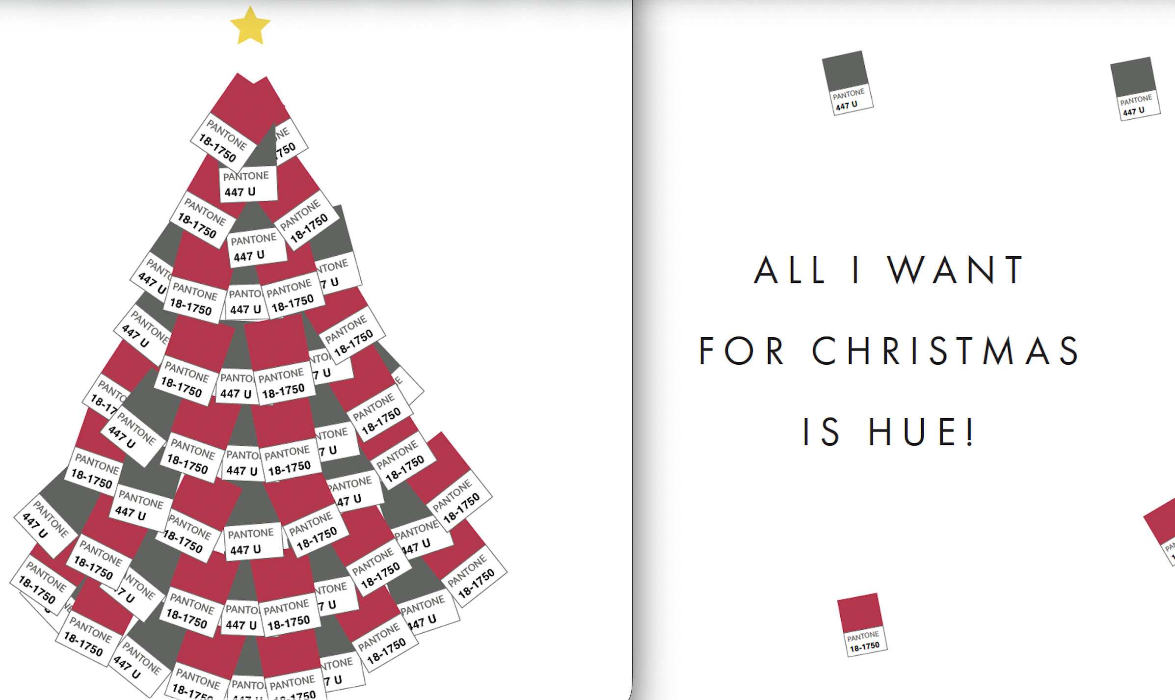
One was inspired by my not-so-secret obsession with Pantone colors, letting our brand palette take center stage. Another turned our colors into a Christmas tree, because for some of us, all we really want for Christmas is hue.
There’s also one from the years John Seymour served as our art director. John and Ted shared a wonderful creative relationship built on trust, humor, and mutual respect. John understood that sometimes the best creative days were the quiet ones, and he valued those just as much. We remember him with gratitude.
And then there was the year the printer mixed up the inside names. The first card read “All Is Bright.” The second read “All Is Right.” Instead of panic, we chose humor and a quick fix. Proof that even when things go sideways, how you respond is what people remember.
These cards aren’t about perfection. They’re about personality, perspective, and connection. They’re reminders that good marketing doesn’t have to shout. Sometimes it just has to show up, feel human, and mean something.
Thank you for being part of our story. We are grateful for the trust you place in us, the relationships we’ve built, and the work we get to do alongside you.
Wishing you a joyful Christmas season and a bright start to the new year.
With gratitude,
Kerry
One was inspired by my not-so-secret obsession with Pantone colors, letting our brand palette take center stage. Another turned our colors into a Christmas tree, because for some of us, all we really want for Christmas is hue.


